10 open source projects every JavaScript geo dev should know about. Regardless of whether you’re a hacker or a well-seasoned developer, writing JavaScript geo apps from scratch takes some serious time, skill, and effort.
Thankfully there’s a few places you can go to get a head start, like the esri.github.io site. There you’ll find over 170 geo projects on GitHub that are ready to go. Most of the projects use the ArcGIS APIs and services to do something “geo”, but many integrate with other technologies as well, and others are pure JavaScript solutions. The other cool thing is that they are all on GitHub, so if there’s a feature missing, it’s easy to make a pull request or log an issue to get it added! Here are 10 projects that should help you get your JavaScript mapping apps out the door faster. 1. quickstart-map-js – Looking for some short JavaScript examples to do things like add points to a map, change basemaps, find places, get directions or perform spatial analyses?
3. esri-leaflet – If you like Leaflet, then you’ll love esri-leaflet! Kartograph.org. How to make a choropleth map with Google Fusion Tables. Data mapping is becoming an increasingly popular way of visualising information.
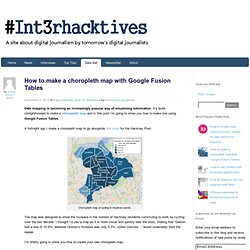
It’s quite straightforward to make a choropleth map and in this post I’m going to show you how to make one using Google Fusion Tables. A fortnight ago I made a choropleth map to go alongside this story for the Hackney Post. Choropleth map of cycling in Hackney wards The map was designed to show the increase in the number of Hackney residents commuting to work by cycling over the last decade. I thought I’d use a map as it is more visual and quickly tells the story. I’m briefly going to show you how to create your own choropleth map. The data that I used is from the Greater London Authority’s website and was published in October. First of all I created a Google Docs spreadsheet showing the percentage increase of every Hackney ward: Once I had manually entered these data, I put them on to a map using Google Fusion Tables.
Importing a spreadsheet to Google Fusion Tables This will show you something like this: Crosslet. Get to Know a Projection: Gene Keyes' 40-Year Quest for the Perfect Map - Wired Science. Gene Keyes and his hand-drawn Cahill-Keyes projection.
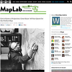
(Credit: Gene Keyes) All Gene Keyes ever wanted was a perfect map. It would have all the features in proportion, measured and accurate down to the tightest possible measurement. It would be a map he could look at for hours, days, years. Was it too much to ask to find a flat surface that projected the globe with minimal distortion, high accuracy, and maximum aesthetic appeal? Keyes never found his perfect map, because he’s still making it. Keyes called his projection the Cahill-Keyes Octal Gradient. It all started in 1973.
Two years later, his thesis was long published, but Keyes’ curiosity still paced the map like a caged tiger, hungry for answers. Slits on the Cahill (left) reach 22.5° into the map, penetrating the Russian Mainland. Starting in February of 1975, he went on a “study and design marathon,” scouring several of the libraries around Toronto, where he was pursuing his doctorate in political science.