
Usability Lessons from Website Eye Tracking Studies.
Ui Tiles la ressource pour préparer vos web designs. Cette semaine une ressource très intéressante à découvrir avec Ui Tiles qui propose un véritable kit pour réaliser des wireframes en toute simplicité ! Un kit complet pour préparer vos sites web Si vous avez l'habitude de réaliser en amont de vos web designs des wireframes ou croquis pour imaginer l'ensemble des pages et fonctionnalités de votre projet, vous devrez aimer Ui Tiles. Cette ressource regroupe une grande diversité de pages et d'éléments afin de composer facilement et rapidement vos idées.
Ce travail peut s'avérer très utile pour valider avec un client son site web avant d'entamer la partie graphique, mais également poser à plat un site complexe. Une ressource complète, libre de droits et gratuite ! Ui Tiles propose 72 modèles de bases, ensuite vous êtes libre de pouvoir composer les vôtres selon vos idées et besoins.
Si vous êtes webdesigner, chef de projet, ergonome ou simplement passionné par le web, cette ressource devrait vous servir.
WEB ANALYTICS TOOLS. USER RESEARCH. Officelovin - discover the best tech and startup offices. My app design workflow. Start low-fi I always start with a non-Retina, 1× document size.
For an iPad app, it’s 1024×768. For an Android app, it’s a common device size, in mdpi or dp (density-independent pixels). For a Mac app, it’s often 1280×768 (a frankenstein combination of the 13-inch MacBook Pro resolution horizontally, and the 11-inch MacBook Air resolution vertically, ensuring the app will fit on the smallest current Mac displays).
For an iPhone app, it’s 320×568, or one of the sizes below. Home/ IxD Awards. Google Consumer Surveys. Google Consumer Surveys. Sample Survey Website Information Quality Quality and completeness of web site documentation and information. Repository. Design activities Co-designing Envisioning Testing & Prototyping Implementing Representations Texts Graphs Narratives Games Models Stakeholders Professionals Service staff Users Context System Offering Interaction Actors map Affinity diagram Blueprint Character profile Cognitive walkthrough Constructive interaction Customer Journey Map.
Label Placement in Forms. By Matteo Penzo Published: July 12, 2006 “We were able to subject Luke’s theories to usability testing and enrich them through the power of numeric data.”
In using eyetracking to evaluate the usability of search forms for my previous article for UXmatters, “Evaluating the Usability of Search Forms Using Eyetracking: A Practical Approach,” we discovered much interesting data. Gmail. UX Project Checklist. Sell Your Videos and Distribute Them Everywhere - Gbox. 9 basic principles of responsive web design. Responsive web design is a great solution to our multi-screen problem, but getting into it from the print perspective is difficult.
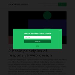
No fixed page size, no millimetres or inches, no physical constraints to fight against. Designing in pixels for Desktop and Mobile only is also the past, as more and more gadgets can open up a website. Therefore, let's clarify some basic principles of responsive web design here to embrace the fluid web, instead of fighting it. UX of Software Things.
If you’re part of a team that build software products, you’ve probably heard about UX before and you know it’s kind of important.
But often in stand-up’s, I hear developers say: “the work I’m doing at the moment doesn’t really form part of the UX”. Just the other day a developer said to me that he was doing work that wasn’t part of the UX. He was optimising the speed of database queries, so that the reports in our system can load faster to lessen the load on our servers. Naturally, I explained to him that his work was indeed part of the UX, because it would directly impact users in a positive way.
Wireframe UX Prototyping Tool. One Site Fits All: A Responsive Solution. With 56% of American adults owning a smartphone and 34% owning a tablet and with 1.2 billion devices projected to be sold in 2013 , smartphone and tablet access continues to skyrocket.
9 GIFs That Explain Responsive Design Brilliantly. What is responsive design?
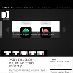
Most people vaguely understand that it refers to websites that work just as well on desktops as they do on smartphones, but there's a lot more to it than that, leading to widespread confusion (heck, I'll admit, I've even been known to misuse it myself, even after fellow Co.Design writer John Pavlus called me a dummy for it). But the principles of responsive design aren't that hard to understand, thanks to this amazing collection of animated GIFs put together by the guys Froont, a San Francisco-based company specializing in making tools for designers to create responsive websites. Spend just a few minutes with these GIFs, and you'll never be hoightily corrected by a design pedant about "responsive websites" versus "adaptive websites" ever again. In fact, you can be that hoighty pedant! The GIFs below show many of the basic principles of responsive designs, with explaining quotes by Froont co-founder Sandijs Ruluks.
[Images: Sandijs Ruluks/Froont] UXPin: UX Design & Wireframing Tools As Beautiful As Your Work. The Hipper Element.