
Error Bar Charts in R. The textbook example file ChickFlick.dat is delimited, not comma separated values.
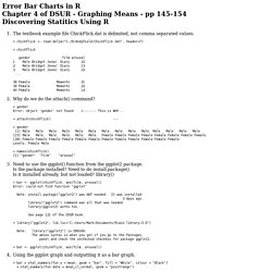
> chickFlick <- read.delim("C:/R/AndyField/ChickFlick.dat", header=T) > chickFlick gender film arousal 1 Male Bridget Jones' Diary 22 2 Male Bridget Jones' Diary 13 3 Male Bridget Jones' Diary 16 ... 38 Female Memento 31 39 Female Memento 22 40 Female Memento 14 Why do we do the attach() command? > gender Error: object 'gender' not found <------- This is WHY... > attach(chickFlick) --- > gender [1] Male Male Male Male Male Male Male Male Male Male Male Male Male Male [15] Male Male Male Male Male Male Female Female Female Female Female Female Female Female [29] Female Female Female Female Female Female Female Female Female Female Female Female Levels: Female Male > names(chickFlick) [1] "gender" "film" "arousal" Need to use the ggplot() function from the ggplot2 package.
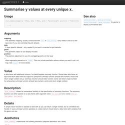
Is the package installed? Need to do install.package() Is it installed already, but not loaded? Geom_text. ggplot2 0.9.3.1. Stat_summary. ggplot2 0.9.3.1. # Basic operation on a small dataset d <- qplot(cyl, mpg, data=mtcars) d + stat_summary(fun.data = "mean_cl_boot", colour = "red") p <- qplot(cyl, mpg, data = mtcars, stat="summary", fun.y = "mean") p # Don't use ylim to zoom into a summary plot - this throws the # data away p + ylim(15, 30)
Ggplot2: stat_summary() Opts_chunk$set(comment = "", error= TRUE, warning = FALSE, message = FALSE, tidy = FALSE, cache = F, echo = T, fig.width = 6, fig.height = 6) options(width = 116, scipen = 5) References Load ggplot2 library(ggplot2) Summary Summarizing the y values for each unique x value can be useful. Currently, there is a bug (version 0.9.3) that prevents summary stat from working with line geom. Even the ggplot2 web site has gone wrong. Plotting means and error bars (ggplot2) This page was recently updated to reflect changes in the new version of ggplot2, 0.9.3.
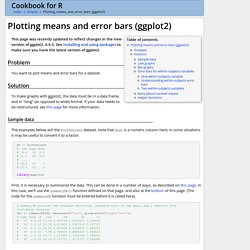
See Installing and using packages to make sure you have the latest version of ggplot2. Problem You want to plot means and error bars for a dataset. Solution. R - Plot mean, standard deviation, standard error of the mean, and confidence interval. Plotting means and error bars (ggplot2) R - ggplot2: add color to boxplot - "Continuous value supplied to discrete scale" error.
R - ggplot2: add color to boxplot - "Continuous value supplied to discrete scale" error. Technical Tidbits From Spatial Analysis & Data Science. Even the most experienced R users need help creating elegant graphics.

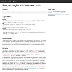
The ggplot2 library is a phenomenal tool for creating graphics in R but even after many years of near-daily use we still need to refer to our Cheat Sheet. Up until now, we’ve kept these key tidbits on a local PDF. But for our own benefit (and hopefully yours) we decided to post the most useful bits of code. Geom_bar. ggplot2 0.9.3.1. The heights of the bars commonly represent one of two things: either a count of cases in each group, or the values in a column of the data frame.
By default, geom_bar uses stat="bin". This makes the height of each bar equal to the number of cases in each group, and it is incompatible with mapping values to the y aesthetic. If you want the heights of the bars to represent values in the data, use stat="identity" and map a value to the y aesthetic. By default, multiple x's occuring in the same place will be stacked a top one another by position_stack. If you want them to be dodged from side-to-side, see position_dodge. Sometimes, bar charts are used not as a distributional summary, but instead of a dotplot. A bar chart maps the height of the bar to a variable, and so the base of the bar must always been shown to produce a valid visual comparison. A quick introduction to ggplot() I gave a short talk today to the [Davis R Users’ Group] about ggplot.
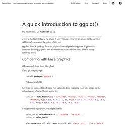
This what I presented. Additional resources at the bottom of this post ggplot is an R package for data exploration and producing plots. It produces fantastic-looking graphics and allows one to slice and dice one’s data in many different ways. Comparing with base graphics (This example from Stack Overflow) First, get the package: Bar and line graphs (ggplot2) Problem You want to do make basic bar or line graphs.
Solution To make graphs with ggplot2, the data must be in a data frame, and in “long” (as opposed to wide) format. If your data needs to be restructured, see this page for more information. Basic graphs with discrete x-axis With bar graphs, there are two different things that the heights of bars commonly represent: The count of cases for each group – typically, each x value represents one group.
In ggplot2, the default is to use stat_bin, so that the bar height represents the count of cases. Bar graphs of values Here is some sample data (derived from the tips dataset in the reshape2 package): dat <- data.frame( time = factor(c("Lunch","Dinner"), levels=c("Lunch","Dinner")), total_bill = c(14.89, 17.23))dat library(ggplot2) In these examples, the height of the bar will represent the value in a column of the data frame.
These are the variable mappings used here: R - ggplot2: add color to boxplot - "Continuous value supplied to discrete scale" error. Summer 2010 — R: ggplot2 Intro. Contents Intro When it comes to producing graphics in R, there are basically three options for your average user. base graphics I've written up a pretty comprehensive description for use of base graphics here, and don't intend to extend beyond that.

Base graphics are attractive, and flexible, but when it comes to creating more complex plots, like this one, the code to create it become more cumbersome. Both and make creating plots of multivariate data easier. The website for ggplot2 is here: It I would highly suggest getting a copy of the manual: Amazon (as of July 2010, it looks like you can buy it new for cheaper than used!). Basics is meant to be an implementation of the Grammar of Graphics, hence gg-plot. Plots convey information through various aspects of their aesthetics. X position y position size of elements shape of elements color of elements The elements in a plot are geometric shapes, like points lines line segments bars text Layer by Layer Displaying Statistics.
R - Issue with ggplot2, geom_bar, and position="dodge": stacked has correct y values, dodged does not. Error Bar Charts in R. Software and Programmer Efficiency Research Group. Specifying Colours In R, a colour is represented as a string (see Color Specification section of the R par() function).
Basically, a colour is defined, like in HTML/CSS, using the hexadecimal values (00 to FF) for red, green, and blue, concatenated into a string, prefixed with a "#". A pure red colour this is represented with "#FF0000". Predefined Colour Names Besides the "#RRGGBB" RGB colour strings, one can also use one of R's predefined named colours: Facets (ggplot2) This page was recently updated to reflect changes in the new version of ggplot2, 0.9.3.
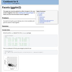
See Installing and using packages to make sure you have the latest version of ggplot2. Problem. Bar and line graphs (ggplot2) Technical Tidbits From Spatial Analysis & Data Science.