
Puffin Chalk — TANAMACHI STUDIO. Use The Whole Font. Small caps, ligatures, kerning and more will be revealed as your mouse hovers across this beautiful page.
Designed by Christopher Clark and Nick Sherman, The Font Bureau Turn contextual alternates, stylistic sets and swashes on and off with one click. Designed by Monotype Imaging A scroll through OpenType with FF DIN Round, FF Mister K and friends. Designed by Christoph Koeberlin and Jens Kutílek, FontFont All three pages use the font-feature-settings property and run in both IE10 and Firefox. Typo/graphic posters. Georgia and Verdana go pro.
10 New Free Fonts for Your Delight. All About BIG and BOLD Typography. There are many ways to attract viewers’ attention when it comes to web design.Flash techniques, awesome photography & catchy color schemes are just some of the many methods used to create visual interest.
There is something even simpler that can create a big impact…kick-ass Typography. How Cloud Computing Made Web Typography Better For Everyone. What’s makes sites like A Working Library and Pictory stand out from the pack in terms of readability?
Clear, humane typography, of course. But what makes that possible? Web fonts: legally-licensed real typefaces dynamically served via "the cloud" using Javascript and CSS. Sound like Greek to you? Me too. Before Typekit, what options did a web designer have for incorporating imaginative typography into her site designs? Before web fonts, type designers offered desktop font licenses that web designers could use to replace fonts on the web: either as static images, or (if permitted by the license) via Flash or JavaScript techniques like sIFR and Cufon. 42 Amazing Resources for Inspirational Typography. There are many theories to what constitutes good typography, its not as simple as choosing an appropriate font and setting it in the style of a particular project, that would be too easy. Theories and tutorials are one thing, putting typography into perfect practice is another, and is perhaps the hardest part of any design.
Every designer you ask will give you a different answer to what constitutes good type, where is the benchmark? Below you will find the best typography sites, rich full of inspiration, tutorials, theories, free fonts, good practices… everything you could possibly need related to typography. Typographica. Beautiful Typography in Web Design. Typography is a very important part of web design.
By using different types of typography like big headlines and bold fonts web designers are improving the look and feel of websites. So in this post we have compiled some beautiful typography for your inspiration. kylemkramer wakwaw denisechandler moresoda eeharbor steedicons visualrepublic foreverheavy threepennyeditor inflicted adoreyou convergese losttype. 25 Examples of Big Typography in Web Design. Here at WDL we love typography and we are constantly showing our readers good typo usage, from print to logos, from web to random typographic works, we really feel the need to keep the juices flowing in that area, and we could not forget to mention all the free fonts we like to show you!
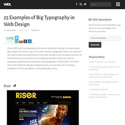
So today we decided to show our love for typography gathering some examples of big typography in web design. From bold and colorful letters to delicate handwriting ones, you will find a lot of inspiring examples of how to get attention using typography, enjoy. Riser Karb Bellstrike The Lost Thing Joel Andrew Glovier Soulwire cookiesound McFarlane Change Management Skewed Icons Rice Bowls. The Rules of Typography. The most popular fonts used by designers. There are usually two camps among designers when it comes to typeface choices.
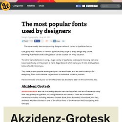
One group has a handful of favorite typefaces they adapt to every design they create, believing that these handful of typefaces can be suitable for every situation. The other camp believes in using a huge variety of typefaces, picking and choosing each one based specifically on the project at hand. Regardless of which camp you fit into, the typefaces below should interest you. They have proven popular among designers the world over, and are used in designs for everything from multi-national corporations to individual books or journals. The A-Z List of Free Serif Fonts for Design. Get the FlatPix UI Kit for only $7 - Learn More or Buy Now It’s almost impossible to have too many fonts installed on your system, especially when it comes to Serif fonts.
The importance of the Oxford comma. Mastering Font Combinations. Remember the days of the Commodore computer?
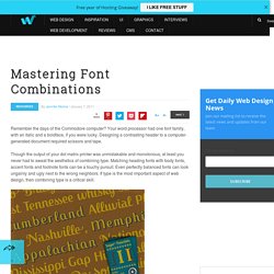
Your word processor had one font family, with an italic and a boldface, if you were lucky. Designing a contrasting header to a computer-generated document required scissors and tape. Though the output of your dot matrix printer was unmistakable and monotonous, at least you never had to sweat the aesthetics of combining type.
Mind Your En And Em Dashes: Typographic Etiquette - Smashing Magazine. Advertisement An understanding of typographic etiquette separates the master designers from the novices.

A well-trained designer can tell within moments of viewing a design whether its creator knows how to work with typography. Typographic details aren’t just inside jokes among designers. Font Conference. Best Fonts for Titles and Headlines. If you write for a site or a magazine, it is the content and the title that meets the visitor’s eye before they read in detail.
The headline gives the reader a prior idea of what the site is all about. A bold headline or a title with a captivating font is the first step to win the whole battle. They grow the reader’s interest to stay on the page, instead of giving it a look and move for another interesting one. Here is some information on eye catching and bold fonts to galvanize the sites look and invite more readers. “Old Sans Black” is one of the more popular fonts that contain certain attractive features. Another well known type font is “SF Movie Poster”. How to Choose a Typeface - Smashing Magazine. Advertisement Choosing a typeface can be tricky. The beauty and complexity of type, combined with an inexhaustible supply of options to evaluate, can make your head spin. But don’t be baffled — and don’t despair.