
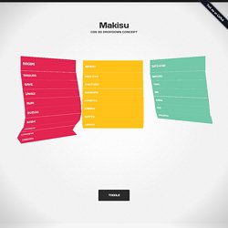
Makisu ~ CSS 3D Dropdown Concept. Nigiri Maguro Sake Unagi Buri Suzuki Saba Iwashi Kohada Hirame Tobiwo Maki.
Lab/flip/ CD Cover animations.
Top HTML5 template. Responsive. Top design. Top css3. Switching stacked cards. Fluid CSS3 Slideshow with Parallax Effect. Parts of the book. The Best CSS3 Tools, Experiments And Demos For Web Developers. CSS3 is already the present on the Web.

An authentic reality bursting with possibilities. On a daily basis Awwwards selects the best of the Web universe with the most spectacular examples of the latest version of web styling language par excellence.Tools & Generators | Experiments & Demos | Animations & PicturesEnjoy! CSS3 Tools & Generators: At the same time that the use of CSS3 has extended, lots of tools and code generators have popped up all over the place to try and facilitate coding work and simplify the application of new properties for the developer. We've talked about some of these in a previous post, but there are more and better.Lea Verou, member of the Awwwards Jury 2012, is one of the most prolific creators of these fantastic tools.
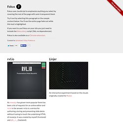
Fokus - Emphasized text-highlighting using JavaScript. It's that time of the year again!
In late 2010, having spent five great years working at Fi, I was determined to change up my professional life. After interviewing with Qwiki and accepting the position of Lead Interactive Developer it was decided; I was moving to San Francisco! It took a good few months of hard work to sort out all of the practicalities but it was definitely worth it now that I'm here. Fortunately I've still been able to keep this site updated and worked on a variety of projects and experiments throughout the year. The first project to see the light of day was Sketch, a drawing tool that mimics the style of old cartoons.
Sketch was followed by a short freelance project which involved building an interactive and animated logo for a Canadian media production company called Meru. Next I stumbled into the land of CSS3 3D transforms and ended up trying them out on two projects; Holobox and CSS3 3D Slideshow (later renamed reveal.js). Hakimel/reveal.js. Beercamp: An Experiment With CSS 3D. Advertisement I recently had the pleasure of organizing this year’s Beercamp website.
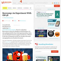
If you’re unfamiliar, Beercamp is a party for designers and developers. It’s also a playground for front-end experimentation. Each year we abandon browser support and throw a “Pshaw” in the face of semantics so that we can play with some emerging features of modern browsers. Beercamp 2012. Drop-In Modals - ZURB Playground - ZURB.com. Simple Modals The simple modal style we show here is very basic, but effective.
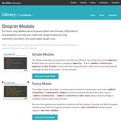
The modal itself is set to opacity: 0.0 and when we click the button it changes to opacity: 1.0. A -webkit-transition: opacity 0.25s linear on the shown state causes the fade in effect, so we only need javascript to change the state of the modal — not the animation. Show the Simple Modal Fancy Modal This modal is shown and hidden in a similar manner. We use a few properties like transforms, transitions and box shadows. Show the Fancy Modal Copyright ZURB, freely available for distribution under the MIT license. This is a simple modal. It appears based on one line of javascript and can be dismissed using the OK button below. This is a fancier modal. Linear Gradients. Transforms. CSS3 transitions, transforms and animations. Browser Support for 2D CSS Transforms How to use transforms There are two categories of transform - 2D transforms and 3D transforms. 2D transforms are more widely supported, whereas 3D transforms are only in newer browers. 2D examples This div has been skewed - note that the text is still selectable.
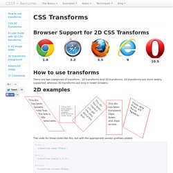
This div has been scaled - again, the text is real text. This div has been rotated - you get the idea about the text! This div has been translated 10px down, and 20px across. This div has all four types! The code for these looks like this, but with the appropriate vendor prefixes added: CSS transforms also be animated using transitions - try hovering on the div below. Hover on me and I'll spin and scale! Your browser doesn't support CSS 3D Transforms :( Try one of the browsers mentioned below. CSS3 transitions, transforms and animations. Browser Support for CSS transitions How to use transitions If you haven't used transitions before, here's a brief introduction.
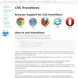
On the element you want to have animate, add the following CSS: There is a lot of duplication due to vendor prefixes - until the specification if finalised, this will persist. If this bothers you, there are various tools such as CSS Scaffold, LESS, or my preference - SASS, that allow you to define mixins to avoid repetitive code. Another approach is simply to write the CSS without the prefixes, then use Lea Verou's -prefix-free to add them in at runtime. Something you definitely shouldn't do is to only include the webkit prefix. Menu avec slider effet transition - Réaliser un effet de bloc dépliable en CSS avec opacité. Galerie photo hover avec transition CSS - Utiliser les transitions pour créer une galerie photo. Flip-card avec les transformations 3D CSS - Réaliser un effet de retournement 3D avec CSS3.
Menu Slides avec CSS3 - Créer des blocs dépliables animés en CSS3. Attention : Un bug étrange a été détecté sous Chrome/Safari sur Mac.
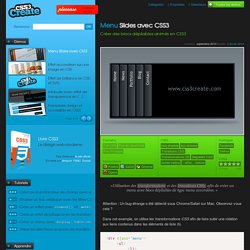
Observez-vous cela ? Dans cet exemple, on utilise les transformations CSS afin de faire subir une rotation aux liens contenus dans les éléments de liste (li). <div class="menu"><ul><li><a href="">Home</a><div><h3>Home</h3><p>Bienvenue sur le site CSS3Create</p></div></li><li><a href="">News</a><div><h3>News</h3><p>Pleins de news sur CSS3 et sur HTML5</p></div></li> ...
</ul></div> Réglage de la taille d’un li et application de la transition sur la taille. 0.15s correspond au retardement de la transition, afin d’éviter un déclenchement trop rapide de chaque slide. overflow:hidden permet d’éviter le débordement des éléments masqués. Navigation slide CSS3 avec :target et transitions - Utilisation de :target pour créer une navigation design. Animation CSS et effet typographique 3D - Utiliser les transformations 3D CSS pour réaliser une animation sympa. Rotation d’un menu en CSS3 - Créer ce menu rotatif avec les Animations CSS. Créer le nouveau menu Mac Apple en CSS3 - Pure CSS3, sans utilisation de Javascript.
Effets de survol avec transitions et filtres CSS - Donner de la profondeur à vos galeries photos. Marche à suivre Pour réaliser cet effet, utilisez une simple liste d’images que vous positionnez à votre convenance.
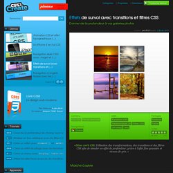
Dimensionnez le tout. Effet coverflow en full CSS - Utiliser les sélecteurs avancés, les transitions et les transformations CSS. Cet effet est maintenant un peu dépassé.
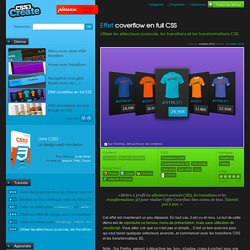
En tout cas, il est vu et revu. Le but de cette démo est de reproduire ce fameux menu de présentation, mais sans utilisation de JavaScript. Vous allez voir que ce n’est pas si simple... C’est un bon exercice pour qui veut tester quelques sélecteurs avancés, et commencer avec les transitions CSS et les transformations 3D. Navigation à onglets fluides avec les transitions CSS - Créer un menu avec display: table-cell. Note : ce tutoriel a été initialement publié dans WebDesign Magazine Hors-série 16. Suivez pas à pas les 18 étapes de ce tutoriel. 01 - La structure HTML La première étape de ce tutoriel consiste à créer notre structure HTML. Pour ce menu, nous avons besoin d’une liste de liens. Build free HTML email templates. Colorzilla présente un éditeur de dégradé pour CSS3. Colorzilla présente un éditeur de dégradé pour CSS3 Cet article a 3 années. Il commence à dater, lisez-le donc en gardant son âge en tête ! Merci publié le Lu 4 234 fois.