
Create a jQuery Sliding Door Effect – 10 Best jQuery Tutorials. 15th Aug 2011 | Posted by Eko S. | 7 Comments With a simple jQuery animation you can add numerous effect and improves the design integration with web sites and applications. And one of a cool effect you can add is sliding door, usually applied to an image if hover – where the image slides to left or right side and reveals the text behind it. In this post we have collected 10 best tutorials to create a jQuery sliding door effect, to help you implemented in your site or web project. Best jQuery Tutorials The Easiest Javascript Sliding Door Effect Tutorial with jQuery by Kevin Liew This time is the well known sliding door effect that slide the top layer to top, bottom, left or right direction to reveal the content underneath.
Tutorial Demo. Best 20 webfonts from Google Web Fonts and @font-face embedding. At the moment there are several ways to use non-system fonts on a website.

We will focus on the two least complicated, least expensive systems, Google Web Fonts and the @font-face rule. Fear not, we have not ruled out other paid methods such as Typekit, Fonts.com Web Fonts, Fontdeck, Webtype, WebINK or Fontspring for future posts as they certainly offer high quality typefaces and deserve to be considered. It’s important to be aware that web fonts can generate inadequate visualizations on operating systems which have subpixel rendering turned off in the case of Windows XP.
They can also be represented differently depending on the browser used to visualize them. The aim of this post is to facilitate the choice of a series of fonts (out of the hundreds available) whose technical and visual characteristics make them more readable and compatible with a wide variety of devices, browsers and operating systems. Basically, there are two implementation models: 1. 2. Web font embedding services 1. The Creative Way To Maximize Design Ideas With Type. Advertisement As with most designers, being sure that we explore and select the most successful, memorable and stimulating designs is a vital aspect that underpins every project we undertake.
For us, the beginning of a new challenge has never been as simple as asking ourselves what might be the best avenue to take and then sitting down at a computer and attempting to fulfill that idea. After researching the subject matter, we will almost always begin with a sheet of paper and pencil and draw out a variety of design options to help bring together and develop the breadth of ideas that are maturing in our minds. In this article, we will explore the use of drawing and mark-making as an integral part of the creative process. Coding Q&A With Chris Coyier: Code Smell and Type on a Grid. Advertisement Howdy, folks!
Welcome to the new incarnation of Smashing Magazine’s Q&A. Designing For Device Orientation: From Portrait To Landscape. Advertisement The accelerometer embedded in our smart devices is typically used to align the screen depending on the orientation of the device, i.e. when switching between portrait and landscape modes.
This capability provides great opportunities to create better user experiences because it offers an additional layout with a simple turn of a device, and without pressing any buttons. However, designing for device orientation brings various challenges and requires careful thinking. The experience must be as unobtrusive and transparent as possible, and we must understand the context of use for this functionality. Nearly all mobile and tablet applications would benefit from being designed for device orientation.
Coding Q&A With Chris Coyier: Responsive Sprites And Media Query Efficiency. Advertisement Howdy, folks!
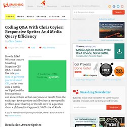
Welcome to more Smashing Magazine CSS Q&A. It works like this: you send in questions you have about CSS, and at least once a month we’ll pick out the best questions and answer them so that everyone can benefit from the exchange. Your question could be about a very specific problem you’re having, or it could even be a question about a philosophical approach. We’ll take all kinds. If you’re interested in exploring more Q&A, there’s a bunch more in my author archive. Resolution Aware Sprites Joshua Bullock asks: Your last round of questions was titled “Box-Sizing And CSS Sprites” which offered some great answers for two separate items, but didn’t take them that one step further for responsive design.
Retina displays made a really quick and big jump in resolution. If you are drawing a solid red box on the screen, no problem at all! One solution is to make all your original images bigger. Your question was explicitly about sprites. Compose to a Vertical Rhythm. “Space in typography is like time in music.
It is infinitely divisible, but a few proportional intervals can be much more useful than a limitless choice of arbitrary quantities.” So says the typographer Robert Bringhurst, and just as regular use of time provides rhythm in music, so regular use of space provides rhythm in typography, and without rhythm the listener, or the reader, becomes disorientated and lost.
On the Web, vertical rhythm – the spacing and arrangement of text as the reader descends the page – is contributed to by three factors: font size, line height and margin or padding. All of these factors must calculated with care in order that the rhythm is maintained. The basic unit of vertical space is line height. Establishing a suitable line height The easiest place to begin determining a basic line height unit is with the font size of the body copy. Spacing between paragraphs With our rhythmic unit set at 18px we need to ensure that it is maintained throughout the body copy. Front-end Style Guides. We all know that feeling: some time after we launch a site, new designers and developers come in and make adjustments.
They add styles that don’t fit with the content, use typefaces that make us cringe, or chuck in bloated code. But if we didn’t leave behind any documentation, we can’t really blame them for messing up our hard work. To counter this problem, graphic designers are often commissioned to produce style guides as part of a rebranding project.