

Stellar - Pangram Pangram. Font. CODE Pro - Fontfabric™ Code Pro is a font family inspired by the original Sans Serif fonts like Avant Garde or Futura, but with a modern twist.
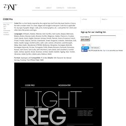
It is clean, elegant and straight-to-the-point. Code font is applicable for any type of graphic design—web, print, motion graphics, etc. —and perfect for t-shirts and other items like posters and logos. Format: Opentype (.otf) Compatible: PC & Mac Details: 586 Character Set, Manual Kerning, Tracking / Pairs Price: Free / $29 Downloadfree fonts or Buy Full versionstarts from $16 /View License/ With your donation we’ll be able to spend more time to improve and update our free fonts. Search Creative Bloq. Font Pair - Helps designers pair Google Fonts together. Beautiful Google Font combinations and pairs. Christian. Free Font Pacifico by Vernon Adams. This license can also be found at this permalink: Copyright (c) 2011, Vernon Adams (vern@newtypography.co.uk), with Reserved Font Name Pacifico.
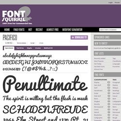
This Font Software is licensed under the SIL Open Font License, Version 1.1. This license is copied below, and is also available with a FAQ at: —————————————————————————————- SIL OPEN FONT LICENSE Version 1.1 - 26 February 2007—————————————————————————————- PREAMBLE The goals of the Open Font License (OFL) are to stimulate worldwide development of collaborative font projects, to support the font creation efforts of academic and linguistic communities, and to provide a free and open framework in which fonts may be shared and improved in partnership with others. The OFL allows the licensed fonts to be used, studied, modified and redistributed freely as long as they are not sold by themselves.
DEFINITIONS “Font Software” refers to the set of files released by the Copyright Holder(s) under this license and clearly marked as such. 20 Best And Worst Fonts To Use On Your Resume. Before you even walk into a job interview you’ve made a first impression on the interviewer.
How? Through your resume. According to a study conducted by the job search site TheLadders.com, recruiters spend only about six seconds scanning a resume. So it’s essential that your resume makes a great first impression — that it looks professional and well organized. How do you do that? You start by using a resume font people can actually read (that’s what this post is for), then you design a resume that stands out from the rest (here’s how you do that). When you have both these things you go into Canva and design the thing for free in no time (here’s how you upload fonts from this article into Canva and here’s where you go in Canva to start your new resume design right now). The Best Resume Fonts 01. Times New Roman is probably the most commonly chosen fonts for resumes — the very reason you should avoid it, and why it appears on our “Worst” list. 10 Golden Rules You Should Live By When Combining Fonts: Tips From a Designer.
A photography instructor once told me that “You have to know the rules before you can break them.”
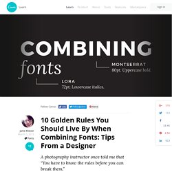
That’s the (simultaneously frustrating and freeing) thing about art and design — there may be some rules; there may be some best practices; but there are very few that are set in stone. Bending or breaking the rules is always a possibility in the right context. So how do we go about learning how to effectively combine fonts? By looking a few guidelines, we can see what has proven to work well as a starting point, then get comfortable moving beyond those basics if a design calls for it. 01.
Many fonts have distinct moods or personalities — serious, casual, playful, elegant. As is often the case with people, opposites tend to attract: “introverted” and “extroverted” fonts balance each other nicely when combined. Deciding whether two or more fonts complement each other can feel like something of a guessing game. 02. 03. In addition to size, font styles also affect readability.
20 Typography Mistakes Every Beginner Makes – And How You Can Avoid Them. Much more than just arranging pretty fonts on a nice background, typography is an essential part of most designs — one that can make or break a whole project.
Unfortunately, typography errors tend to make a bigger statement than good typography. Mistakes stick out like a sore thumb, while thoughtful typographic choices blend so nicely with the overall design that you might overlook them. So if you want to get your message across without distracting typographic errors, learn to recognize some of the most common mistakes below, and use this article as a final checklist before wrapping up your design. 01. Crowding Your Letters: Tracking It’s a tempting fix: You’re short on space; you need to fit in a certain amount of text; so what do you do?
02. This applies to whole lines of text, too. 03. Another rookie mistake (similar to the previous one) is stretching or condensing words to fit into a certain space. But there are ways to avoid this problem. 04. 05. Type Genius. 19 top fonts in 19 top combinations. Sign up and download immediately to take your typography to the next level!
This classic contains some great stuff: An exceptional glossary of typography terms Killer tips on establishing typographic color Choosing and using the right typefaces 20 Action-packed info-dense pages! 19 top fonts in 19 top combinations. Writing a Resume: Which Fonts Are Best? Credit: lyeyee/Shutterstock Want to make sure a hiring manager reads your résumé?
A good first step is to type it in a legible, professional-looking font. You might be the perfect candidate, but employers will never know it if they can't even make out the text on your application.