
UXploration. Taylor Hu - Blog Template. 52 Weeks of UX. The other day our friend Whitney Hess innocently tweeted: "I find mental models really trying.
Does that make me a less skilled UXer? " I know how she feels. I have dozens of books on my shelves describing different processes for doing design, from mental models to personas to content audits to user testing to you-name-it, and I follow almost none of them. I use bits and pieces, of course, but cannot follow any one of them faithfully. Part of the doubt that Whitney displayed is the result of that unseen enemy called the “Process Police”, or people who go around espousing their preferred process as the right way to design…as if those who aren’t doing the process are designing complete rubbish.
The Process Police do their rounds on email lists, where they give out subtle digs that you’re doing it wrong. Here’s the secret: the Process Police are secretly worried they’re doing it wrong. The good thing about benchmarks is that you can to optimize for them. But we’re fine. Alice Hung. Design Details: Twitter for iOS. I imagine that most people don’t actively use two Twitter accounts on their phones, so I’d like to share a few “hidden” interactions on the Twitter app for iOS7 that make it, well, delightful, to switch accounts.
The smooth animations, the light bouncing and the many ways to switch between accounts represent a wonderful attention to detail that many apps just don’t have. Follow me at @brian_lovin for tweets about design, startups and technology. Get emailed with future Design Details posts: Subscribe by Email 1. Press + hold the “Me” button on the bottom navigation bar (View normal resolution) 2. 3.
Sweat the small stuff - it’s the tiny details that will delight your users. Design Mania. 创意十足的图表欣赏. 大数据时代数据满天飞,我们会用一个个图表把那些看起来零碎的数据整合起来,一个有创意并且条理清晰的图表不仅视觉上给人眼前一亮,更能充分地对数据进行展示与分析。
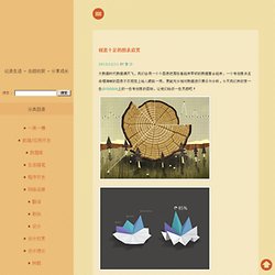
今天我们来欣赏一些dribbble上的一些有创意的图标,让他们给你一些灵感吧! 我们可以看到很多表格都是以扁平的风格呈现,加上鲜明的色彩对比让这样的数据展示简单清晰,当然良好的布局也就是怎么样把一组相关的数据关联起来是数据展示的关键,所以在动手弄好看的图表之前我们应该对我们手中的数据进行分析。 非科班的如何成为 UI 设计师? // 图月志 // JJ Ying 的界面设计博客. 因为我自己是一个 0 美术基础、非计算机、非艺术类科班出身,但从事视觉设计工作的同学,所以很多大学里学着不喜欢的专业,想要转做设计但又不知从何开始的朋友都来问过我类似「我怎么才能成为一个 UI 设计师?」
的问题。 尝试在这边统一回答一下吧: 首先请想清楚为什么想转设计,以我的经验,一般在大学里想转设计有这么一些原因:1. Leongao. 向若珲的微博. 开发频道 - 用户体验. Web, Mobile, UX and UI Designers. App UI 元素. 有很多设计师非常狂热的收集UI Kit,然后抽丝剥茧的一层层模仿学习大师们的设计手法和建层习惯!
确实,这招是非常适应新手向高手学习的捷径之一。 这期的… Read Article → 今天推送的资源是一组消息(警告、通知等)弹出框的PSD,一共65个,包括弹出式、下拉式等,全都免费下载哟,你可以应用个人或者商业的作品中。 2014. 引人入胜的引导页设计. 引导页是用户在首次安装并打开应用后,呈现给用户的说明书。
目的是希望用户能在最短的时间内,了解这个应用的主要功能、操作方式并迅速上手,开始体验之旅。 既然是说明书那难免不受待见,因为我们的用户总是傲娇,他们不喜欢被教育、被说明,他们喜欢一口气划过引导页,直接上手,但是在碰到问题、遇到挫折的时候又会各种别扭。 所以这就需要设计师非常用心的去处理引导页的设计。 丰富多彩、风格迥异的引导页设计 有些引导页则沉稳大气,适合资讯类的应用,给人以可信赖感。 有些引导页则轻松、活泼,适合日常工具或者休闲类的应用,让用户感受到贴心和放松。 Archives. 25.Apr,2014, 11:00 | | Comments.
The Next Web - International technology news, business & culture. 首页 - CSDN移动频道 - CSDN.NET. MUI. The Top UX Predictions for 2014. If 2013 marked a year of frenzied growth in the land of experience design, 2014 could be a year of downright explosive expansion.
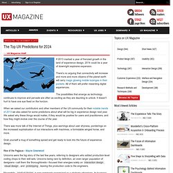
There's no arguing that connectivity will increase and more and more citizens of the planet earth will carry magic glowing mobile lozenges in their pockets. All of them will prefer rewarding digital experiences. The possibilities that emerge as technology continues to improve and pervade are often as exciting as they are daunting to unlock. It doesn't hurt to have one eye fixed on the horizon. When we asked our contributors and other members of the UX community for their notable trends of 2013 we also asked for some predictions about what will be big in experience design next year. There was more talk of the Internet of Things, plus warnings about user shyness, ponderings on the increased sophistication of our interactions with machines, a formidable winged horse, and more.
Rise of the Pegasus - Wayne Greenwood. Adaptive Path. User Experience Stack Exchange. UCD大社区 - 以用户为中心的设计. 指尖上的浏览:如何理解用户的眼?-腾讯ISUX – 社交用户体验设计 – Better Experience Through Design. 生活中很多人会调侃道:“每天手指在手机屏幕上滑动的距离比走路的距离还长!”
随着指尖上的浏览融入到生活的方方面面,如何让用户手指滑动的更有效率,在滑动手指的同时看到更多想看的内容,而不白白滑动手指,是提升手机APP用户体验的重要方面。 百度;MUX;无线;云;产品设计;输入效率;移动搜索;浏览体验… @魔都. Treatise on User Experience Design: Part 1. User experience design is the liaison between the three areas of technology, business, and design.
A good UX designer will have a depth and breadth of experience in all three, not just the visual “graphic design” end or the functional “product development” end. That experience and knowledge is then filtered through the lens of not only the business, but through the user of the product as well. User experience is about being on the outside of the product looking in.
A user experience designer is a detective, a scientist, and a researcher who discovers the users needs and communicates those goals to the business, technology, and design sectors. To truly accomplish the goals of “user experience,” you must reside in the interstitial space between all three. From my perspective, I see a true user experience designer as someone who has experienced the pressures and constraints of all three areas, and knows how to navigate the waters of each. 1. 2. 3. 4. 5. 网易用户体验设计中心. Desiring Clicks.