
40 Best Typeface Combinations in Web Design. When it comes to prints or Web Design, typography is one of the most important part.
So selectng the right type of typography for your web design is one of the most crucial part. Keeping the small textured detail in mind while designing a website can sometimes be enough to get amazing results. A good combination of typeface can enhance the look of your website a lot! In websites, you can use typography in many forms: big bold headers, simple and clean menus and explanatory text etc. 10 Examples of Combining Fonts for Effective Design.
Helvetica Neue and Open Sans Mogreet combines two sans typefaces, Helvetica Neue and Open Sans.
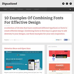
They are very similar so it may be hard to tell the difference. Helvetica however provides better use for large text and headers whereas open sans works better at smaller sizes. Adelle and Helvetica Neue Meltmedia combines the increasingly popular Adelle typeface with the extremely common Helvetica Neue. Best Download Free Fonts. Every one is looking around for high quality fonts to spice up their design.
Here we have collected 125+ free and high quality fonts for you to use in your design. In this selection you find variety of fonts like bold, thin, slab serif, fancy, sans serif, roman style, numerical and many more. Typography plays an important roll in all designers life, let it be a newbie or a pro! Everyone got to have a good understanding for the usage of fonts. Well, in this post I have my recent favorite list of fonts that can be used in any design let it be print or web. Go ahead and Enjoy! Stroke 7 Icon Free Font Set This is a complete set of 140 thin stroke icons inspired by iOS 7. Aurora Free Font Download Here’s the first font I tried to realize. 29 principles for making great font combinations. By Douglas Bonneville on August 11, 2010 When it comes to making font combinations, there are principles and methods, but no absolutes.
You can’t apply all the principles or ideas listed here at the same time. Just peruse this list of ideas and see what strikes you as interesting, and then pursue creating your own interesting typeface pairs! BTW: The Big Book of Font Combinations wants you to stop by and check out its samples. So many fonts, so little time... In no particular order of importance… Combine a serif and a sans serif to give “contrast” and not “concord”. Www.as8.it/handouts/mixing-typefaces_U&lc1992.pdf. I Font You: Find Great Font Combinations. Font Combinator: Choosing fonts, getting great font combination. Infographiclarge_v2.png (PNG Image, 1983 × 1402 pixels) - Scaled (54%) Best Practices of Combining Typefaces. Advertisement Creating great typeface combinations is an art, not a science.
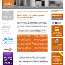
Indeed, the beauty of typography has no borders. While there are no absolute rules to follow, it is crucial that you understand and apply some best practices when combining fonts in a design. When used with diligence and attention, these principles will always yield suitable results. Today we will take a close look at some the best practices for combining typefaces — as well as some blunders to avoid. Combine a Sans Serif with a Serif By far the most popular principle for creating typeface combinations is to pair a sans serif header typeface with a serif body typeface. In the example below — a typical article layout — we have Trade Gothic Bold No.2 paired with Bell Gothic on the left side.
Putting these two together creates an unwanted conflict in the design. Now let’s look at the example on the right. Avoid Similar Classifications Now notice the example on the right side. Assign Distinct Roles Don’t Mix Moods. 19 top fonts in 19 top combinations. Sign up and download immediately to take your typography to the next level!
This classic contains some great stuff: An exceptional glossary of typography terms Killer tips on establishing typographic color Choosing and using the right typefaces 20 Action-packed info-dense pages! Type Connection. New High-Quality Free Fonts. Advertisement Meet the new Sketch Handbook, our brand new Smashing book that will help you master all the tricky, advanced facets of Sketch. Filled with practical examples and tutorials in 12 chapters, the book will help you become more proficient in your work. Get the book now → Every now and then, we look around, select fresh free high-quality fonts and present them to you in a brief overview.
The choice out there is enormous, so the time you need to find them is usually time you should be investing in your projects. In this selection, we’re pleased to present Signika, Plastic Type, Bariol, Alegreya, Metropolis, Typometry and other quality fonts. Free Quality Fonts Link Signika2 A remarkable sans-serif typeface with a gentle character, Signika was developed for wayfinding, signage and other media in which clarity of information is required. Sullivan8 Sullivan is a bold display face that comes in three variations. Sánchez44 Sánchez is a display serif type family. Last Clicks Link (al)