
Designing For Android. Advertisement For designers, Android is the elephant in the room when it comes to app design.

As much as designers would like to think it’s an iOS world in which all anyones cares about are iPhones, iPads and the App Store, nobody can ignore that Android currently has the majority of smartphone market share and that it is being used on everything from tablets to e-readers. In short, the Google Android platform is quickly becoming ubiquitous, and brands are starting to notice. But let’s face it. Android’s multiple devices and form factors make it feel like designing for it is an uphill battle. If all this feels discouraging (and if it’s the reason you’re not designing apps for Android), you’re not alone. This article will help designers become familiar with what they need to know to get started with Android and to deliver the right assets to the development team. Android Smartphones And Display Sizes Two common Android screen sizes.
What You Need to Know About Screen Densities Dashboard. Forms On Mobile Devices: Modern Solutions. Advertisement Mobile forms tend to have significantly more constraints than their desktop cousins: screens are smaller; connections are slower; text entry is trickier; the list goes on.

So, limiting the number of forms in your mobile applications and websites is generally a good idea. When you do want input from users on mobile devices, radio buttons, checkboxes, select menus and lists tend to work much better than open text fields. But constraints breed innovation, and mobile forms are no different. The limitations of mobile devices have forced developers and designers to find new ways to allow users to input data faster and more easily. Field Zoom In many mobile Web browsers, when a user selects a form’s input field, the “field zoom” feature expands it to fill the screen’s viewable area. The Safari browser on Apple’s iPhone makes use of field zoom together with a “form assistant.” However, not everyone will know about the form assistant or know how to hide the keyboard.
Input Formats. Finger-Friendly Design: Ideal Mobile Touchscreen Target Sizes. Advertisement In darts, hitting the bulls-eye is harder to do than hitting any other part of the dartboard.
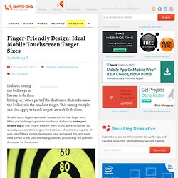
This is because the bullseye is the smallest target. This same principle can also apply to touch targets on mobile devices. Smaller touch targets are harder for users to hit than larger ones. When you’re designing mobile interfaces, it’s best to make your targets big so that they’re easy for users to tap. (Image credit: ogimogi) What the Mobile Platform Guidelines Say Apple’s iPhone Human Interface Guidelines recommends a minimum target size of 44 pixels wide 44 pixels tall.
While these guidelines give a general measurement for touch targets, they’re not consistent with each other, nor are they consistent with the actual size of the human finger. Small Touch Targets Lead to Big Problems Small touch targets make users work harder because they require more accuracy to hit. Not just that, but small touch targets can lead to touch errors. Thumb use among mobile users is popular.
(al) (fi)