
Foundation: The Most Advanced Responsive Front-end Framework from ZURB. Diseño web fluido y plantilla fluida con HTML5 y CSS3. Demo Diseño web fluido con HTML5 y CSS3 principalmente nos permite crear paginas web que en su dimension se ocupan totalidad del tamaño de navegador.

Tecnicas HTML5, CSS3, JS permiten con mas rapidez convertir su pagina web en un modelo fluido. Como demonstracion de todo lo que vamos a explicar les presentamos plantilla fluida con HTML5 y CSS3. Para crear paginas web fluidas tenemos que saber como trabajar con: fluid layout, fluid widths, fluidos: texto y imagenes, videos y iframes, fluid margins y paddings, fluidos: tables y forms, menu adaptable.
Creacion y tecnicas para crear paginas web fluidas o liquidas. La principal idea para crear el layout fluido con HTML5 y CSS3 es definir el tamaño para los elementos de la pagina en porcentajes o EMs, que permite segun redimensionar el tamaño del navegador cambiar su tamaño. Para crear fluid layout se usa esta formula: target ÷ context = result target - font-size(o width) que tenemos en pixeles. 1. Fixed example y Fluid example 2. Texto y Imagenes.
Introducción al Diseño Web Adaptable o Responsive Web Design. Hoy en día los usuarios de nuestras páginas web o tiendas online pueden acceder a las mismas desde diferentes medios: un ordenador de sobremesa con pantalla panorámica, un móvil, una tableta… Partiendo de la base de que el diseño de una web, para que funcione, tiene que estar centrada en el usuario (y no en el diseñador, en el programador o en el dueño de la web), es importante que la experiencia que tiene el usuario con nuestra web sea lo más placentera posible con independencia de qué medio esté usando para verla.

A better Photoshop grid for responsive web design. Posted on 20 January 2012 • 90 comments In making the move to responsive web design, one of the potential hurdles is the rather awkward maths for calculating the percentage-based widths necessary for fluid layouts.
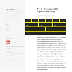
If, for example, you’re designing with a 960px grid in Photoshop and you have six columns, each 140px wide, you divide 140 by 960 to get your percentage-based width: 14.583333%. Now, I don’t know about you, but numbers like that look a little scary. It doesn’t matter that there are great calculation tools built into TextMate to do the maths for you; the point is that the final figure looks like an arbitrary number with no immediate relation to either the container’s pixel width (960) or the element’s pixel width (140). Compare that to a container that has a width of 1000px. 1000 is a nice, easy, round number.
Here’s the PSD. But what about our precious 960 grids? » CSS Media Query for Mobile is Fool’s Gold Cloud Four Blog. Read the follow up article written August 21, 2013 Ethan Marcotte’s article Responsive Web Design has caught the imagination of web developers.

Several subsequent articles have touted the CSS media query feature as a way to build mobile-optimized web sites. Even I’m guilty of contributing to this meme with my article on CSS orientation. Unfortunately, CSS media query is fool’s gold for mobile devices. 50 Useful Responsive Web Design Tools For Designers. Como crear Layouts elásticos usando la medida Em. En éste artículo que me ha regalado Jon Tan para que lo publicara para los que no entendais inglés, mostraremos el proceso completo para la creación de un layout elástico básico, qué es exactamente un “em”, como calcularlos y como usar ems para crear capas elásticas que permitan mostrar contenido con imágenes y texto elástico, tanto horizontal como verticalmente.

Qué es un layout elástico? Un layout elástico puede escalar según el tamaño del texto definido por el usuario Más concretamente, un interface elástico se mostrará según el tamaño de letra del navegador —generalmente 16px por defecto—y los usuarios podrán modificarlo si lo desean. Algunas personas hacen un cambio permanente por razones de accesibilidad, otras usan los controles del IU para incrementar el tamaño del texto cuando es necesario. Para hacer una prueba de que es a lo que me refiero pulsa comando (la tecla de la manzana) o control en Windows y pulsa las teclas de más y menos: El tamaño del texto aumenta y disminuye. N.B. Android - Crear aplicaciones compatibles con múltiples pantallas.
A la hora de desarrollar una aplicación Android deberemos tomar varias decisiones muy importantes, como puede ser, el nivel de API mínimo que vamos a soportar y el tamaño de pantalla de los dispositivos para los que nuestra aplicación va a estar optimizada.

En el primero de los casos cuanto menor sea el nivel del API nos aseguraremos un mayor mercado potencial de usuarios-dispositivos que van a poder descargar nuestra aplicación. Diferencias entre diseño líquido y diseño responsive. Cada día accedemos más a internet a través de teléfonos y tabletas.

Cuando analizamos las métricas de nuestros clientes del sector de la hostelería nos encuentramos (mayo 2012) que aproximadamente el 40% de las visitas a sus webs se realizan a través de teléfonos móviles. Curso gratis de Curso Dreamweaver CS6. aulaClic. 18 - Diseño de página. Maquetación web. En esta edición CS6, Dreamweaver presenta un nuevo tipo de diseño fluido que supone un avance en el campo del diseño.

Aprende ya Diseño Web Responsive: El Layout Fluido. Less Framework 4. I called Less Framework "a CSS grid system for designing adaptive websites".
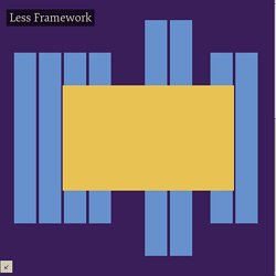
It was basically a fixed-width grid that adapted to a couple of then popular screen widths by shedding some of its columns. It also had matching typographic presets to go with it, built with a modular scale based on the golden ratio. The resources it was originally published with are still available on GitHub. Contrary to how most CSS frameworks work, Less Framework simply provided a set of code comments and visual templates, instead of having predefined classes to control the layout with. This is how I still work today and definitely a method I advocate. /* Default Layout: 992px.
Using Media Queries in the Real World. Warning This article was written over six months ago, and may contain outdated information.

Recently I’ve been working on the new website for my employers, Poke London, which launched last week. Responsive Design bookmarklet. Gridpak - The Responsive grid generator. Amazium - The responsive web framework..! Introducción a Media Queries con CSS3. ¿Qué son los Media Queries? La rápida distribución de dispositivos móviles, ha puesto el mundo del web de cabeza. Los usuarios ya no ven únicamente contenido web en computadoras de escritorio, sino en smartphones, tabletas y otros dispositivos con un amplio rango de dimensiones. El reto para los diseñadores web es asegurar que sus sitios puedan verse bien, no sólo en una pantalla grande, sino también en una pequeña pantalla de celular y cualquier pantalla de por medio. Los Media Queries, son una excelente forma de entregar diferentes estilos para diferentes dispositivos, y proveer la mejor experiencia para cada tipo de usuario.
Como parte de la especificación CSS3, los Media Queries expanden el rol del atributo media, que controla como se aplican los estilos. Las Figuras 1- 3, muestran los Media Queries en acción. Figura 1. Convert a Menu to a Dropdown for Small Screens. Diseño Web Adaptable o Responsive Web Design. 320 and Up ‘tiny screen first’ responsive web design boilerplate. Convert a Menu to a Dropdown for Small Screens. Responsive Data Table Roundup. There has been a bunch of takes on responsive data tables since I first published about it. The idea of the original was to abandon the grid layout of the table and make each cell its own line. Each of those lines is labeled with a pseudo element. This creates a much taller table, requiring more vertical scrolling, but does not require horizontal scrolling. Responsive Tables Demo. A quick and dirty look at some techniques for designing responsive table layouts. Uso de “media queries” (CSS3) en la creación de páginas web.
La creciente utilización de pantallas de PC de gran tamaño y la extensión del uso de internet en los móviles obliga a los webmasters a ser capaces de crear páginas webs que se muestren correctamente y sean funcionales en cualquiera de los dispositivos que sean visualizadas. Create an adaptable website layout with CSS3 media queries. Getting started. CatsWhoCode.com.
So, you’ve spent some time building your e-commerce brand. You’re making a handful of sales each month, but it’s not taking off the way you hoped it would. You do a little digging into your analytics and you learn people who spend 20 minutes on your site almost always buy something. But those who check out just one or two pages, well, they don’t stick around long enough to spend any money. What gives? HTML5 Template Generator. The 1140px CSS Grid System · Fluid down to mobile. Skeleton: Beautiful Boilerplate for Responsive, Mobile-Friendly Development.
A better Photoshop grid for responsive web design. Media Queries. A Flexible Grid. Responsive web design. Adapting your website layout to different screen sizes. The best way to discover what a responsive website does? Play! You can try it out using your browser window and other web-enabled devices, like iPhones, Android handsets, tablet computers, netbooks - the list is growing all the time.
As you change the size of your browser window, you’ll notice columns collapsing into single paragraphs or breaking into multiple columns. ResizeMyBrowser. Foundation: The Most Advanced Responsive Front-end Framework from ZURB. Pixel Perfect Responsive Design Testing Tool. Joshuaclayton/blueprint-css. 960 Grid System.