background preloader

Design

Facebook Twitter

Listado de Figuras Retóricas. 35 Beautiful Music Album Covers. Advertisement Album cover art is often considered to be one of the “extincted” fields in modern graphics design. In times when digital copies are cheaper and quicker to get, album covers have somehow lost their importance as less and less customers actually buy CDs and LPs in the stores. That’s a pity because album covers can be extremely expressive and convey the message of the album in a number of creative ways.

This post attempts to prove exactly that. Music and art go hand in hand. Below we present 35 excellent examples of beautiful, creative and impressive album covers that will certainly inspire you to head down to the local record shop and start browsing through records and labels. This post was updated. Album Covers The Mars Volta “Frances the Mute”1 Danger Doom – The Mouse and the Mask3 Michael Jackson: Dangerous by Mark Ryden5 Devil’s Gun – Raising The Beast6 Smashing Pumpkins: Zeitgeist by Shepard Fairey8 Keane: Under The Iron Sea by Sanna Annukka10 Arcade Fire: Funeral Godspeed You!

Tipografía. 27 mar Tipos en 3D Este estudio Londinense llamado Johnson Banks, crea un poroyecto llamado Arkitypo con la colaboración de la universidad de Medios Digitales de Ravensbourne. Curioso, curioso… 7 feb Dark Knight Rises Titles Mirar que pedazo de titulos de créditos de apertura de la última película de El Caballero Oscuro “Dark Knight Rises“, que se ha currado el “Videoartista” Dogan Can Gündogdu que se los imaginó para la nueva película de Batman para finales de este año.

Sobre una música de Massive Attack. 10 nov The New York Times _ edición Turca Pedazo de creatividad para el lanzamiento de la edición Turca del New York Times, a cargo de la agencia Leo Burnett y dirigido por Quba Michaiski. 19 jul Yulia Brodskaya, arte de papel Para los que conozcais a Yulia Brodskaya, tenéis que ver esto!!!.

26 abr Graffitis naturales ¡Que inspiradora la obra de Anna Garfort! 14 abr André Beato Link: André Beato 24 mar Tipografia en 3D links: Chris Labrooy 15 mar El arte de pelar… El arte de pelar…. finamente con WMF. Diseño Gráfico México e Internacional Blog Vecindad Gráfica Tecnología Cultura Digital Web. Photos from rompetechos | Zooomr - Comparte tus fotos. Programas y recursos. RAFAEL HOUEE Portfolio. Shirt.Woot. 80 efectos de texto con Photoshop. Create a Trendy Typographic Poster Design.

This post was originally published in 2008 The tips and techniques explained may be outdated. Using simple shapes can produce some great looking contemporary designs that fit well as impactful posters, a good example being the recent Trendy Geometric Lines tutorial. This time we'll look at stripping back the tools to creating an interesting and eye-catching poster with a single typographic word. Find a random image to base the design on, the subject of the photo isn't at all important, just choose a picture with varied contrast and preferably tailored towards your chosen colour scheme. In this case I've picked out a landscape scene with a mix of blues and greens.

Open up the image in Adobe Photoshop and resize accordingly. Go to Filter > Blur > Gaussian Blur, drag the slider almost all the way to the maximum to completely disguise the original subject and blend together the colours and tones. Head over to the fantastic Bittbox.com and download one of the free high-res textures. Colorful Glowing Text Effect in Photoshop. After seeing some recent Type work by Vicenç Fontanet (or, Drasik), in his recent project for “Miniblack“, I just had to give the effect a shot myself in Photoshop. 
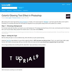
It’s a wondeful little style that could easily be integrated into any dark graphic design where some upbeat text is needed.

Step 1 – Choosing a Background For the best results with this effect, you’ll want to use a dark background. The background should have a hint of color, and should avoid from being too dark (such as pure black). Being inspired from Drasik’s work, I’ll use a dark violet (#120612). Just to get this out of the way, as you may notice throughout this tutorial, there are LOTS of different ways to go about accomplishing this effect – this is just the way I found to be most convenient.

Step 2 – Setting the Type We’ll be setting the type in a not-so-traditional way, which will allow us to get a special layering. You’re image probably looks something like this (Quick Note: Type used below is Century Gothic): Step 8. Abduzeedo | Graphic Design Inspiration and Photoshop Tutorials. Free Vector Designs: Vector Materials : Vector Art | Graphichive.Net. 40 Ilustraciones brillantes y creativas. Artista Blog. Alebarba.com. Figuras Retoricas. Figuras retóricas en imágenes. Figuras retóricas: Por medio de las figuras retóricas se puede expresar un mensaje de diversas formas dotándolo de sorpresa y a la vez convenciendo. Esta se manifiesta en lo verbal (nivel de signos simbólicos); en imágenes (nivel de signos icónicos); en la relación entre lo verbal y las imágenes (integración de símbolos e iconos). Algunas figuras teóricas planteadas por Ferraz Martinez son: · Antítesis: contraposición de ideas. · Paradoja: unión de ideas antagónicas. · Hipérbole: exageración ponderativa. · Símil: comparación · Metáfora: cambio de sentido de la palabra basado en relaciones de semejanza. · Metonimia: cambios de sentido basados en relaciones de contigüidad. · Personificación: atribución a seres inanimados de rasgos propios de los animados. · Sinécdoque: es una licencia retórica mediante la cual se expresa la parte por el todo.

SINFRENO | Reciclaje creativo. Reciclar, Recuperar, Reutilizar, Eco productos,… Jahara Studio noviembre 29, 2010 de jordiboix El diseñador brasileño Brunno Jahara de Jahara Studio ha creado una colección de muebles hechos con madera de desecho. Los armarios y escritorios estan terminados en el interior con una lámina hecha de botellas de PET reciclado.

Cuatro décadas del símbolo del reciclaje noviembre 22, 2010 de jordiboix Estamos de Aniversario: El símbolo universal del reciclaje, hoy en dominio público, surgió como una idea de una empresa de Chicago, la Container Corporation of America, para contribuir a la celebración del primer Día de la Tierra en 1970 y, también, como maniobra publicitaria. Poco podían pensar que el símbolo, ganador de un concurso de ideas patrocinado por esa empresa, terminaría por convertirse en uno de los más difundidos y conocidos de la historia. Via: tecnologia obsoleta Guarda tu ipad en una funda biodegradable noviembre 18, 2010 de jordiboix Elegante diseño ecológico para proteger el portátil o el IPAD. Diseño de Jaime Salm, Brian Kelly. 
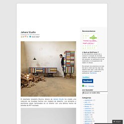
Diseño Gráfico Sostenible.

El jardín de la victoria del mañana 1 Durante la primera y segunda guerra mundial, en EEUU se inició una campaña de concienciación a la ciudadanía sobre la utilización de los jardines y parques para el cultivo de vegetales y frutas: “The Victory Garden”. 
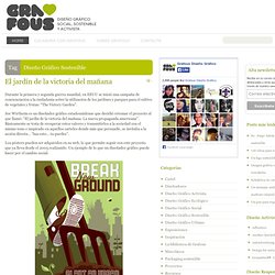
Joe Wirtheim es un diseñador gráfico estadounidense que decidió retomar el proyecto al que llamó: “El jardín de la victoria del mañana. La nueva propaganda americana”. Básicamente se trata de recuperar estos valores y transmitirlos a la sociedad con el mismo tono e inspirado en aquellos carteles donde más que persuadir, se invitaba a la acción directa… “haz esto… tu puedes”.

Los pósters pueden ser adquiridos en su web, lo que permite seguir con este proyecto que ya lleva desde el 2005 realizando. Leer resto del artículo » Una editorial un tanto singular 1 Leer resto del artículo » Hojas y arbolitos verdes. 5 Errores que cometen las marcas al tratar de parecer ser más “ecológicas” 4 Leer resto del artículo » Tarjeta + Germinador 1. Logos. Designorati. Torino 2006 Olympics Logo — Designorati. Want to know what’s behind the Torino’s Olympics logo? Designorati’s “Made in Italy” Editor will tell you Torino is a magnificent city, theater of a lot of Italian history. First capital of Italy in 1861 when the country was still a kingdom, it now hosts the 2006 Winter Olympics games. While pollution has certainly harmed the citiy in many ways, it still remains a beautiful place to visit.

One of Torino’s must-sees is the Mole Antonelliana , the 167.5-meters-tall Torino’s symbol. Torino’s Mole Antonelliana was built between 1863 and 1889 Torino’s architectural work of art becomes a snow montain aiming toward the top, the place where the participants of Olympics Games want to be. The logo also strives to communicate: City/culture — mountain/nature relationship Transparency Dynamism Design and technology A young look More about the logo can be found here . Olympic Look > my experiences in... > Torino 2006 · Welcome to The Olympic Design.com. The concept from which the Torino 2006 Look of the Games arose, is the “Piazza”: a uniquely Italian solution, strongly rooted in history while clearly pointing to the future. Being the Core Graphic of the visual identity of the games, it connects all its basic elements: the Torino 2006 Emblem, the Pictograms and the Mascot. The piazza is the perfect Olympic and Italian metaphor for expressing the Ideals of the Games – friendship, fair play and respect – while offering a modern interpretation of the Italian spirit.

The piazza is full of contrasts. Different structures, cultures, lifestyles, rituals, languages, opinions and beliefs mingle, each retaining their unique character while drawing energy from others. It is here that ideas are born and dreams are realized. Tradition exists with innovation. Smart Logos with Hidden Symbolism. Logos can convey many ideas in one simple design and as designers we need to be fully aware of any hidden symbolism. You should be in full control of your design and use symbolism to convey messages to your advantage as this will further the impact of your logo. For this post, we’ve compiled some great logos that carry hidden symbolism that you can use for inspiration in your own designs. Try to figure what the hidden messages are before reading the explanations. Have the designers manage to convey the right messages for these logos? Please let us know in the comments’ area. Amazon.com The arrow from A to Z, symbolizes what Amazon is known for selling everything under the sun.

Atlanta Falcons This logo doubles as an actual Falcon, and an ‘F’ for Falcons. Baskin Robbins This logo subtly incorporates the number “31″ that was a big part of their older logo Chick-Fil-A The Chick-Fil-A logo incorporates an illustration of a chicken with the ‘C’ in ‘Chick-Fil-A’ in a not so hidden way. City Direct FedEx. 39 Olympic Logos From 1924 to 2012. Living in Vancouver, Canada, I’ve been seeing the logo of the upcoming 2010 Winter Olympic Games more and more around the city as the date draws closer.

I thought it would be interesting to take a look at how the design trends in Olympic logos have evolved over the years. Noticeably, the logos seem to have changed from a monochromatic trend to a more multicolor approach in recent years. Logo design seems to have been streamlined to simpler and cleaner shapes. This article features every logo from the summer and winter Olympic games from 1924 to 2012. Paris – Summer 1924 Lake Placid – Winter 1932 Los Angeles – Summer 1932 Garmisch-Partenkirchen – Winter 1936 Berlin – Summer 1936 St. London – Summer 1948 Oslo – Winter 1952 Helsinki – Summer 1952 Cortina d’Ampezzo – Winter 1956 Melbourne / Stockholm – Summer 1956 Squaw Valley – Winter 1960 Rome – Summer 1960 Innsbruck – Winter 1964 Tokyo – Summer 1964 Grenoble – Winter 1968 Mexico – Summer 1968 Sapporo – Winter 1972 Munich – Summer 1972 Innsbruck – Winter 1976.

Reproducciones de cuadros sobre medida en Reprodart.com. Matthew Carter. Son of Harry Carter, Royal Designer for Industry, contemporary British type designer and ultimate craftsman, trained as a punchcutter at Enschedé by Paul Rädisch, responsible for Crosfield’s typographic program in the early 1960s, Mergenthaler Linotype’s house designer 1965–1981. Carter co-founded Bitstream with Mike Parker in 1981. In 1991 he left Bitstream to form Carter & Cone with Cherie Cone.

He has in recent years designed Verdana and Georgia for Microsoft; these fonts are tuned to be extremely legible even at very small sizes on the screen. In 1997 he was awarded the TDC Medal, the award from the Type Directors Club presented to those “who have made significant contributions to the life, art, and craft of typography”. In 2010, he won a MacArthur Fellowship based on his “exceptional creativity, as demonstrated through a track record of significant achievement, and manifest promise for important future advances”.