
Easy Chalk Ornament Typography in Photoshop. We are heading to the last weeks of 2012 and nothing better than getting ready for the new year with a Photoshop tutorial playing with the number 2013.
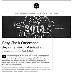
The inspiration for this image was, of course, from one of the trends of 2012: chalkboard typography with ornaments. So in this tutorial we will try to create a stylish ornament typography and then apply a chalkboard effect using Adobe Illustrator, Photoshop and some vector ornaments. The whole process is simple but time consuming, so I would take at least 3 hours to recreate this design. How to Make a Feather Brush in Adobe Illustrator. Creating Paisley Graphic Styles with Scatter Brushes and Recolor Artwork. In today's tutorial I'm going to show you how to create a series of Paisley inspired Graphic Styles using Scatter Brushes and the Appearance panel.
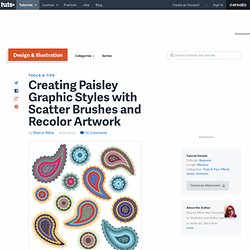
Once done, I'll show you how to create additional styles simply by using Recolor Artwork. This is a great tutorial for beginners as there is no Pen Tool (P) involved. So let's begin! Step 1 First we're going to start by creating our Scatter Brushes which we'll incorporate into our styles. If you create your brushes with a black fill and the Colorization Method as Tints, whatever your stroke color is when you use your brush, will be the color your brush will be. Adobe Ideas Templates. Adobe Ideas Templates As you may know Adobe Ideas has become one of my favorite drawing applications for the iPad.

Over the past couple of weeks I started putting together some template files for Adobe Ideas. At first I started out with just a few storyboard templates, but I couldn’t help making a few more for future projects. In Adobe Ideas you get one photo layer to use as reference along with 10 drawing layers. You can download the templates below and add them to your single photo layer. To use these templates with Adobe Ideas first download the template files and upload them to your Adobe Creative Cloud account.
Step 1: Upload template images to your Creative Cloud account. Step 2: Next, launch Adobe Ideas and click on the photo layer button to bring up the Select Photo option and choose Creative Cloud. Step 3: Now you will see the template files that you uploaded earlier, select the template you want to use and hit ok. Related Projects: Improve your logo design. Great logo design requires a complex mixture of design skills, creative theory and skilful application.
Any designer worth their salt can create a fit-for-purpose logo, but truly mastering all aspects of the craft takes time. Exclusive offer: Save 15% on Adobe Creative Cloud now Of course, logo design is just one small sub-set of branding, but the logo or brand mark remains the centrepiece of most branding schemes. We've spoken to branding professionals about the intricacies of good logo creation, and what qualifies as a great logo. So here are 25 pro logo design tips to help you improve your branding work – from the research phase, through the different stages of logo design craft, and finally the application of the mark. Logo design research and strategy Before pen hits paper on any new logo design project, thorough research is essential. 01. "What Font Should I Use?": Five Principles for Choosing and Using Typefaces.
Advertisement For many beginners, the task of picking fonts is a mystifying process.

There seem to be endless choices — from normal, conventional-looking fonts to novelty candy cane fonts and bunny fonts — with no way of understanding the options, only never-ending lists of categories and recommendations. Selecting the right typeface is a mixture of firm rules and loose intuition, and takes years of experience to develop a feeling for. Here are five guidelines for picking and using fonts that I’ve developed in the course of using and teaching typography. 1. Many of my beginning students go about picking a font as though they were searching for new music to listen to: they assess the personality of each face and look for something unique and distinctive that expresses their particular aesthetic taste, perspective and personal history.
Create a Variety of 3D Lettering Effects for Poster Design. In this tutorial I will showcase three different approaches for creating simple 3D lettering effects in the context of poster design.
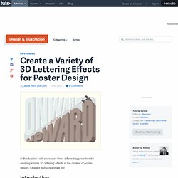
Onward and upward we go! Introduction I will start off by drawing the letter-forms for the three words "ONWARD," "AND" and "UPWARD. " From there I will show three ways to create simple, yet interesting 3D effects. 3D is the latest craze (See: nearly every movie that has come out in the last two years) but my interests are in 3-Dimensional lettering that has old school, subtle, simple, imperfect, more humanistic qualities. Drawing inspiration from vintage poster lettering, and overall aesthetics, everything will be wrapped together to create the full poster design. How to Create a Vintage Ocean Liner Poster. The period between the end of the 19th century and World War II is considered the golden age of the ocean liner.
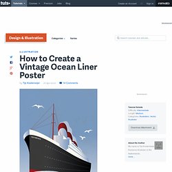
We’ll be starting with a basic sketch of an ocean liner I drew up. How to Create a Line Art Vintage Vector Scooter in Illustrator. In today's tutorial, I'm going to show you how to create a vintage vector scooter illustration.

I'll show you how to create simplified line art without overcomplicating the image. Turning a Photo into Lichtenstein Style Pop Art with Illustrator. Roy Lichtenstein's pop art comic book images are as familiar now as they were in the 1960's.
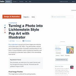
They demonstrate a stylized way of presenting a photo of yourself or anything else you can think of. Using Illustrator's custom brushes and swatches, we'll be recreating a Lichtenstein style of effect in this intermediate level tutorial. Republished Tutorial Every few weeks, we revisit some of our reader's favorite posts from throughout the history of the site. This tutorial was first published in August of 2008. Final Image Preview The image below is what we'll be working towards. Step 1 These comic book images recreated a printing process using what became known as Ben-day dots. Drag the following colors (here shown in hex-values) from the color panel into the Swatches panel. #FCE354 - Hair#E27D89 - Lips#E04359 - Tongue#2489ED - Eyes#FF8048 - Blouse #000000 - Black#FFFFFF - White Double-click on the swatches once in the Swatches panel and name them accordingly.
Create a Shimmering Cityscape in Perspective, Using Illustrator CS5. The Perspective tools in Illustrator CS5 make it a lot easier to draw in perfect one, two or three-point perspective.
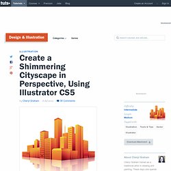
Using symbols in conjunction with the Perspective tools will make quick work of this stylized cityscape. Republished Tutorial Every few weeks, we revisit some of our reader's favorite posts from throughout the history of the site. This tutorial was first published in April of 2011. Step 1 Click the Perspective Grid Tool. A basic 2-point grid is the default setting. Using the Perspective Grid tool, move the Horizon line down, close to the ground level. If you want, you can save this grid as a preset to use for future illustrations.
Step 2. How To Create a Cosmic Abstract Shards Poster Design. Create a Stylish, Vector Hair Typography Illustration. I love creating portraits in vector but what I love even more, is doing wild and crazy hair styles.