
How to Find the Right Chart Type to Represent your Numeric Data. 22 Feb 2016 Charts help you visualize numeric data in a graphical format but the problem is there are just too many types of charts to choose from.
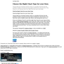
This diagram will help you pick the right chart for your data type. couch mode print story Charts help you visualize numeric data in a graphical format but the problem is there are just too many types of charts to choose from. You have bar charts, bubble charts, pie charts, line histograms and so on. If you are finding it hard to pick the right chart type for your type of data, refer to chart chooser diagram. The poster, designed by Andrew Abela, is also available as a PDF.
Related: Create Graphs Online with Google Charts You may also want to check out Chart Chooser – an online tools that lets you shortlist charts visually. Comments are closed but if you want to respond, please send me an email or tweet. Types of Graphs: Bar Graph, Scatter Plot, Pie Chart. Learning resources: Statistics: Power from data! Graph types: Bar graphs. Archived Content Information identified as archived is provided for reference, research or recordkeeping purposes.
It is not subject to the Government of Canada Web Standards and has not been altered or updated since it was archived. Please contact us to request a format other than those available. A bar graph may be either horizontal or vertical. The important point to note about bar graphs is their bar length or height—the greater their length or height, the greater their value. Bar graphs are one of the many techniques used to present data in a visual form so that the reader may readily recognize patterns or trends. Bar graphs usually present categorical and numeric variables grouped in class intervals. Www.amstat.org/publications/jse/v18n2/cooper.pdf. Www.sciencebuddies.org/science-fair-projects/SciF_Project_Guide_Data_Analysis.pdf.
Graphing and Types of Graphs - Free Analytics & Website Counter. Pie Graph A pie graph is a circle divided into sections which each display the size of a relative piece of information.
Each section of the graph comes together to form a whole. In a pie graph, the length of each sector is proportional to the percentage it represents. Selecting a Graph Type. Juice Labs - Chart Chooser. What is the right graph to use in what situation? November 06, 2008, 8:39 PM — Do you like pie charts?
Have you ever thought about replacing them with a bar chart? Or a line chart? Do you know when to use what chart? Here is a little table that you can use to make your choice: Pie chart - Just don't use them. Bar chart - Use bar charts to show the frequency of the values of a field or the output of an aggregation function. Line chart - Use line charts to show the frequency of the values of a field or the output of an aggregation function.
Link graph - This type of graph is sometimes called a network chart also. There are more complicated graphs that are sometimes needed to visualize your data. . • parallel coordinates or• treemap On the left hand side you see an example of a parallel coordinate plot. Make sure you think hard about what type of chart to use for your data and use-case at hand. Charts and Graphs - Communication Skills Training from MindTools. Choosing the Right Format © iStockphoto A picture is worth a thousand words.

This is certainly true when you're presenting and explaining data. You can provide tables setting out the figures, and you can talk about numbers, percentages, and relationships forever. However, the chances are that your point will be lost if you rely on these alone. Put up a graph or a chart, and suddenly everything you're saying makes sense! Www.preciousheart.net/chaplaincy/Auditor_Manual/11grphd.pdf. Bar Graphs: Bar Graph Examples, What is a Bar Graph? Bar Graph Example Bar graphs are used to present and compare data.
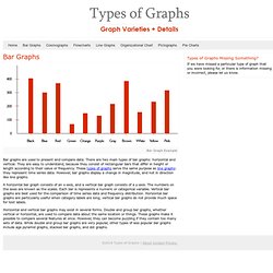
There are two main types of bar graphs: horizontal and vertical. They are easy to understand, because they consist of rectangular bars that differ in height or length according to their value or frequency. These types of graphs serve the same purpose as line graphs: they represent time series data. However, bar graphs display a change in magnitude, and not in direction like line graphs.