
Different Stylesheets for Differently Sized Browser Windows. Otherwise known as "resolution dependent layouts".
Single website, different CSS files for rearranging a website to take advantage of the size available. There is a W3C standard way of declaring them. One way is to test the "device-width", like this: The above code will apply the 800.css styling to the document only if the device viewing it has a width of 800px or wider. And... supports "media queries" in this way. Keep in mind this is the device width, not the current width of the browser window. Seems to me far more useful is the current width of the browser window ("viewport"). That stylesheet will only take affect when the current browser window is between 701 and 900 pixels in width.
Browser Support IE 9+, Firefox 3.6+, Safari 3+, Any Chrome, Opera 10+. Generally, layout is one of those things that it's tough to sell "progressive enhancement" on. If IE support is paramount, we always have JavaScript! Doing it with jQuery Is jQuery really necessary just for this? Video Example One View Demo. CSS Center Screen DIV. All you need to center a div is some CSS.
You may also want to check out my other articles on div positioning: full screen , top right corner , bottom left , and bottom right . You can click the following link to preview this CSS in action: Click here to preview center screen div The CSS Put this code inside the head tag: /*this is what we want the div to look like when it IS showing*/ div . centered { Quick CSS Trick: How To Center an Object Exactly In The Center. I recently needed to make a placeholder page for a site.
I wanted the logo image to be centered exactly in the middle of the screen, that is, both vertically and horizontally centered. Quickly, I thought I'd just give the image element a class of "centered" and then style that class: But as I'm sure you are thinking, this doesn't quite work. What that accomplishes is putting the upper left corner of image exactly in the center of the page, not the center of the image in the center of the page. In order to get the image exactly centered, it's a simple matter of applying a negative top margin of half the images height, and a negative left margin of half the images width. 100 Awesome CSS/Javascript Plugins and Coding Techniques. Writen by Bogdan / Comments Off on 100 Awesome CSS/Javascript Plugins and Coding Techniques If you know how to use CSS and Javascript, you can create some impressive websites.
Not only that you can do some awesome stuff with them but they also ease you work. In this article you have 100 awesome CSS and Javascript plugins and coding techniques that should definitely be in you toolbox. Use CSS3 to Create a Dynamic Stack of Index Cards You will learn how to create a dynamic stack of index cards solely with HTML and CSS3 and use such CSS3 features as transform and transition (for the dynamic effects) and @font-face, box-shadow and border-radius (for the styling).
Dynamic PNG shadow position & opacity You will learn how to create a movable object using javascript. How To Create A Sexy Vertical Sliding Panel Using jQuery And CSS3 Awesome Overlays with CSS3. Code Snippets. CSS - Unordered List Styles (UL) Bullet lists in HTML come in two varieties: Ordered Lists (in which each line begins with a number or letter) and Unordered Lists (in which each line begins with the same bullet shape or image).
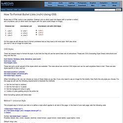
On this page we will discuss how to format unordered lists so they have a bit more style. We'll also show you how to use an image for bullet lists. CSS Styles There are several ways to format the style of your lists but they all use the same basic set of instructions. These are CSS (Cascading Style Sheet) instructions and they look like this: font-family: Verdana, Arial, Helvetica, sans-serif; font-size: 12px; line-height: 2em; These are just a small sample of the styles which are available. List-style-position: outside; list-style-image: url(arrow.gif); list-style-type: square; When formatting a list, you can choose as many of these styles as you like.
CSS Triangle. You can make them with a single div.
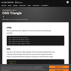
It's nice to have classes for each direction possibility. The idea is a box with zero width and height. The actual width and height of the arrow is determined by the width of the border. In an up arrow, for example, the bottom border is colored while the left and right are transparent, which forms the triangle. Examples Dave Everitt writes in: For an equilateral triangle it's worth pointing out that the height is 86.6% of the width so (border-left-width + border-right-width) * 0.866% = border-bottom-width.