
Creattica: Your source for design inspiration. Top Design Resources for Non-Designers. So you aren’t a professional designer but still want to create beautiful presentations — don’t worry, that’s the majority of us.
Without having to shell out thousands of dollars in years of training or outsourcing, there are some resources that can help you hone your eye (and ability) for great design. I sat down with my design team a few days ago and compiled a list of some of the best presentation design resources on the planet. These resources are no substitute for a well-rounded education in design, but they can serve as a compass that will help guide your presentation to a tropical island of success. They certainly serve that purpose for professional designers, too. Here they are (in no particular order): Creattica This is a beautiful online inspiration gallery that showcases web/UI design, logo design, print design, photography, and artwork from around the web.
Blog. Some Updates from Typedepot Although it's already february it is not that late for new years resolutions.
So here they are - all the projects we are working on right now and we hope we finish in 2013. The first one (which is almost ready) is the updated Corki typeface. We didn't only add lowercase letters but also refined Corki to look even better. You will find it ... Centrale Sans Update It's almost a month since we released our last typeface - Centrale Sans, and we just released an update.
Leyes de la Tipografía. Estos son algunos procedimientos que hay que tener en cuenta a la hora de manipular una tipografía.
Obviamente no son leyes rigurosas que no pueden romperse, pero que son importantes conocer. 1-La altura de las letras debe ajustarse ópticamente. The poster designs of Sven Brasch. Sven Brasch (1886-1970) is undoubtedly the most highly revered Danish poster designer.
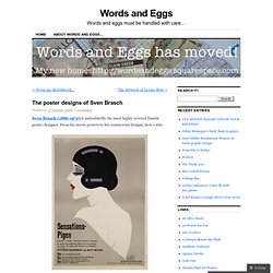
From his movie posters to his commercial designs, here’s why: All images borrowed from Confetta’s Sven Brasch Flickr set. Click over to see more than 60 other Brasch goodies! Support – OpenType. OpenType. OpenType® is a modern font format developed by Adobe® and Microsoft® to provide users with an accessible and advanced typographic toolset.
OpenType improves on PostScript and TrueType just as the DVD trumped the video cassette. When deciding what format to choose, using the latest technology simply makes sense, but let’s dig a bit deeper and explore the ways OpenType makes life easier for typographers and graphic designers. OpenType is Efficient One Style = One File The PostScript format is limited to 256 characters per file.
Based on Unicode, an OpenType file can contain up to 65,535 characters or glyphs. As a concrete example of the efficiency of the OpenType format, compare the multilingual PostScript version of FF Meta 1, a package of four type styles, with its OpenType successor. Narrow this example down to a single style (FF Meta Book), and we can see that the glyphs and metrics from several PostScript files are all included in one OpenType file.
Josep Patau: «Vivir de la venta de tipografía es utópico.» Lost Type Co-op. Ilustres. Ivan Castro. Cómo diseñar un tipo. Vaya por delante que el libro Cómo diseñar un tipo no es un manual para diseñar tipografías.
Más bien se trata de una aproximación al diseño tipográfico. Partiendo de la premisa de que “la composición impresa está unida al lenguaje de una forma inextricable”, Cómo diseñar un tipo nos acerca a los principios del diseño tipográfico, la caligrafía y sus raíces. Pero, como digo, olvidaos de un manual al estilo del Diseñar tipografía de Karen Cheng. Typography & Graphic design. -+-+<<<///_VirusFonts_/_Home_///>>>+-+- Cómo crear tipografías : Tipo e Editorial.
Del boceto a la pantalla Cristóbal Henestrosa · Laura Meseguer · José Scaglione ya puedes conseguir tu ejemplar de cómo crear tipografías por sólo 18 euros mas gastos de envío. enviamos a cualquier ciudad y país. venta exclusiva online, pago con tarjeta de crédito y paypal. los envíos, excepto por mensajería, se realizan los jueves.
Para pedidos de mas de 4 ejemplares es imprescindible ponerse previamente en contacto info@tipo-e.com. Tipografía para descargar - Bonitismos. Paper+ typography on the Behance Network. Blog. Asociación Alcuino para la Recuperación de la Caligrafía Antigua. Friends of Type. The Anatomy of Web Typography. Every conceivable feature of typography can be referred to by its name.
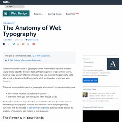
Whether you're talking about the typeface itself, or the arrangement of type within a layout, there's a huge glossary of terms which can help you describe things properly. Let's take a look at the elements of typography which are important to you, as a web designer. .tutorial_image img {height: auto;) Clever Typographic Designs of Famous Scientists' Names. Mumbai-based graphic designer Kapil Bhagat creatively presents the names of some of the world's most famous scientists, honoring their pioneering line of work in the process for National Science Day in India.
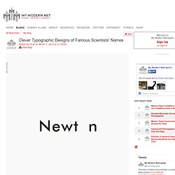
His typographical creations playfully hint at each respective genius's breakthrough discovery. From Darwin's theory of evolution to Pythagoras' theorem and Archimedes' principle, Bhagat covers all scientific grounds with a lighthearted look at the names of the men who have greatly shaped the world we live in today. The artist uses the famous story of Isaac Newton observing an apple falling from a tree, which inspired him to develop his theory of gravitation, to produce a minimalist look at the physicist's name with the "o" in red at the bottom of the frame, mimicking a fallen apple. 10 top typography resources. If you are looking for help with fonts or type, these typography resources are for you.
The web is a wonderful thing, brimming with resources and tutorials for people wanting to learn about the discipline and see some examples of beautiful and innovative typography to inspire. But, sometimes, too much choice can be confusing, so we've picked some top sites that will really help you get to grips with it. Web Fonts. OpenType Control Enable fine typography with kerning and letter spacing controls. Design with ligatures, alternate characters, fractions and other advanced typographic features. Our technology ensures OpenType features can be rendered, even on older browsers lacking native OpenType feature support.
Dynamic Subsetting East Asian languages use thousands of characters making the fonts that support these languages very large in size. CSS Sucker A helpful utility for users of blogs, templates and those not hand-coding their sites, the CSS Sucker identifies CSS selectors used on your site, allowing you to easily apply Web fonts without diving too deeply into the code. Handpicked free fonts for graphic designers with commercial-use licenses. Prensa. Gordo. Ultra Types — Families. Things to look at: Typography. Alan Kitching is a private man. It's not often that you get to see inside his workshop. This is mostly because he's busy and you would only just get in the way, but it only seems to make us all more desperate to see what goes on; to find out how he puts together his complex letterpress work and to delve into his collection of wood type. Nice Web Type.
Welcome to Baseline Magazine. UnosTiposDuros > Teoría y práctica de la tipografía. Fonts, typefaces and all things typographical — I love Typography (ILT) Design & Development: Inklude.com. Sean McCabe on Behance. Typography Served. Design Blog. Valentina Tipografía — Pedro Arilla. Top 10 Fonts of 2012 on Behance. Stereotypes — Type Design and Lettering.